Podology and physiotherapy
IdealMove is an established brand in physiotherapy and podology whose mission is to help people towards truly healthy movement. But despite their expertise and success, their current website at that time was old and with no clear brand direction, every subpage made by a different person with a different taste and without a professional designer overseeing the whole project.
The client
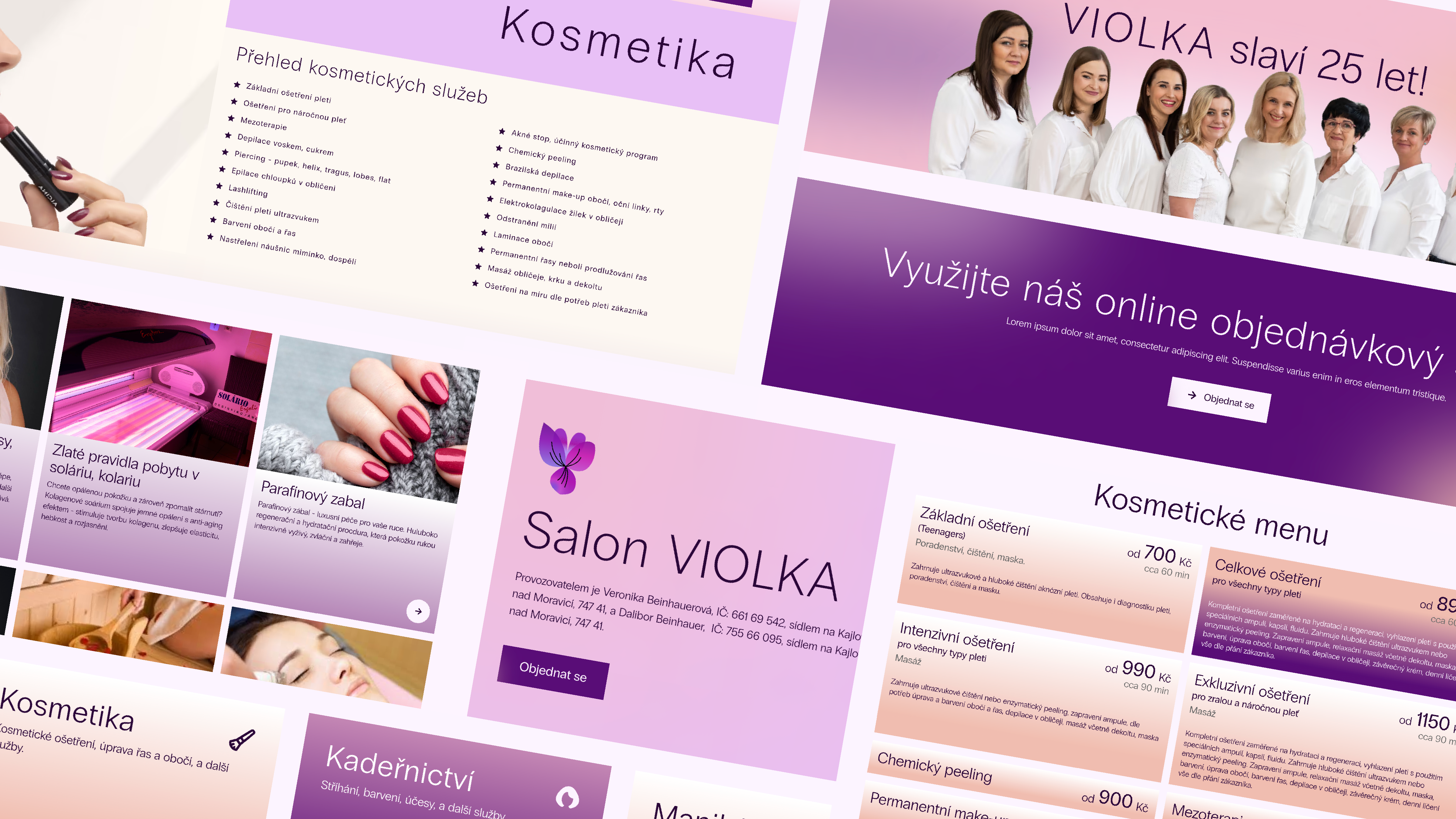
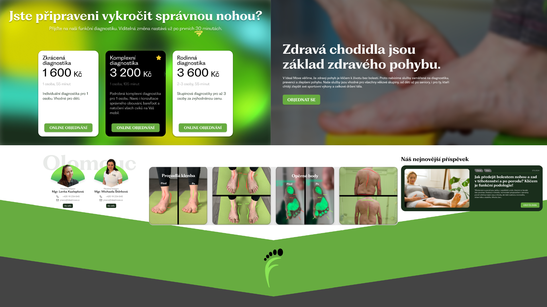
The client is an established brand specializing in podology and physiotherapy, helping their clients improve the health of their feet, their posture and overall movement capabilities (and overall health as a result). The primary purpose of their website is to allow customers to book sessions with their therapists, but also to provide information, present blog posts, offer courses and carrier and to run an e-commerce with their products.
To me this was a challenge, at that time the biggest project I took on, and I was excited to dive deep into it straight away.
The assignment
The client approached me with a desire to update their old website, to make it look nicer. As I learned about their company, I had to read between the lines to realize that what they actually need is this:
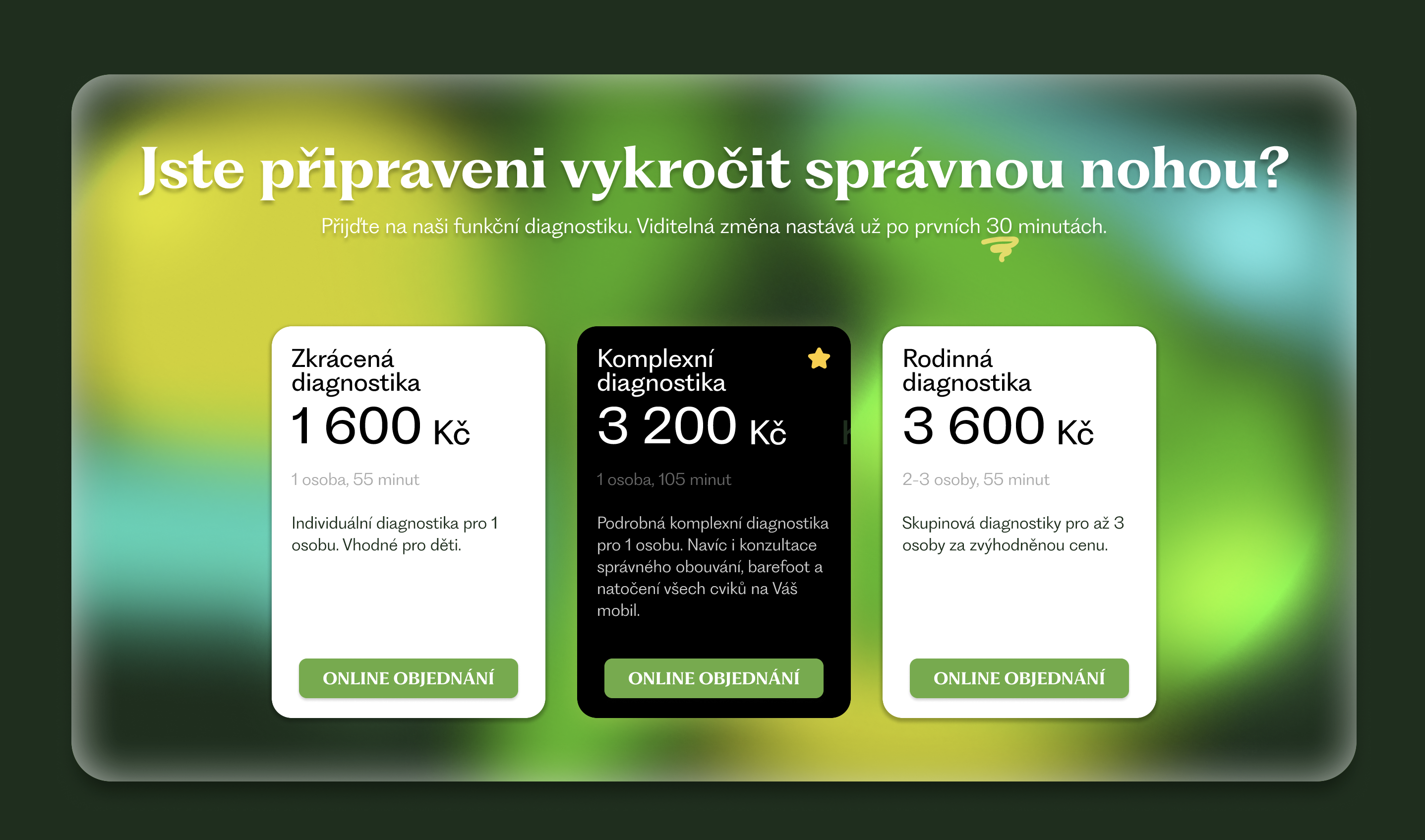
- clean up the funnel from homepage to booking a session
- update of their visual branding
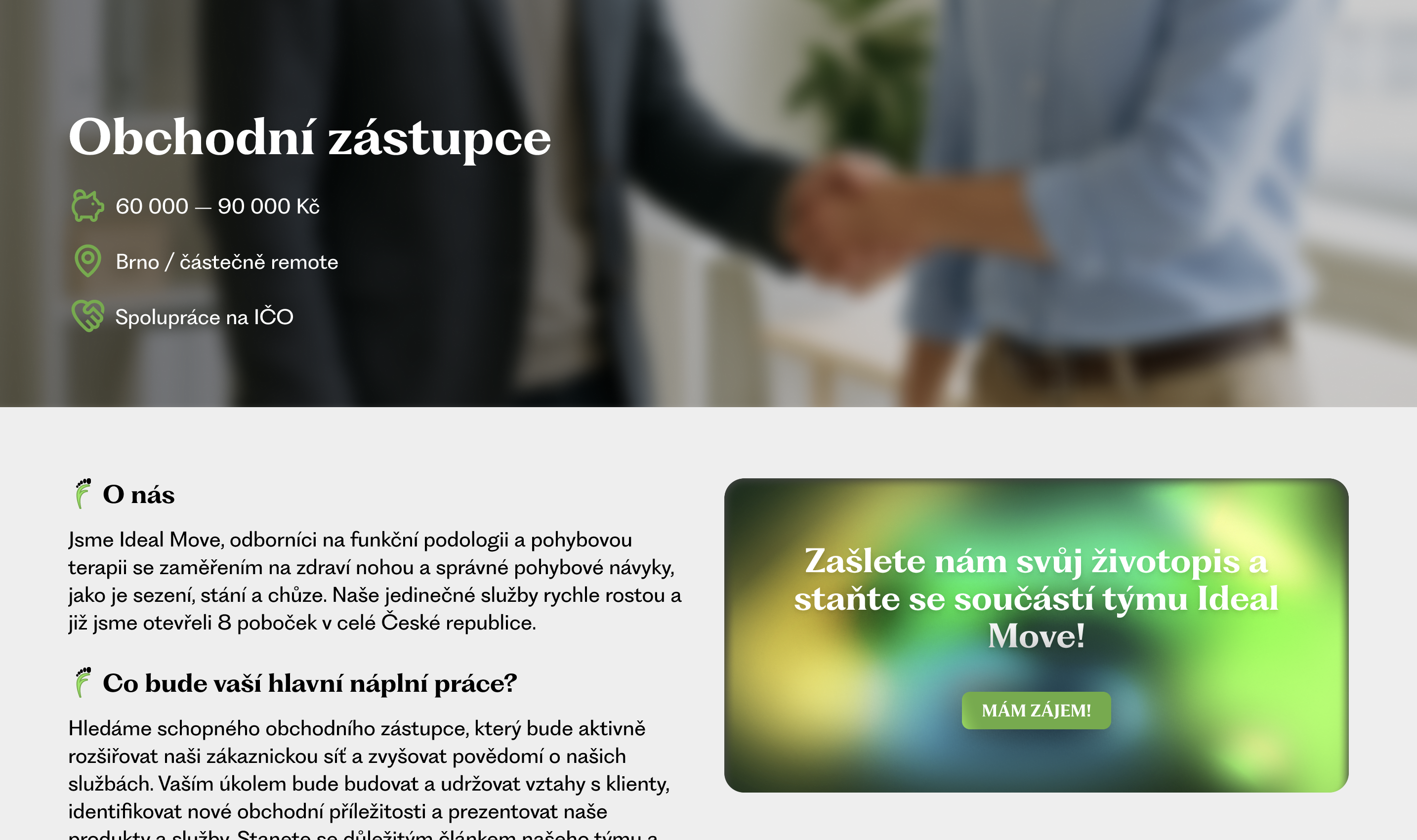
- unification of the visual styles of their various subpages, to promote trust building with thier customers
- stylistic and systematic help with presenting their services and successes, to acquire new customers
- proper hierarchy of their large website, to help viewers navigate it intuitively.
My approach
Immediately during the first discovery calls, I got the client's trust as I've quickly shown them what value a redesign could bring and what specific problems would it solve.
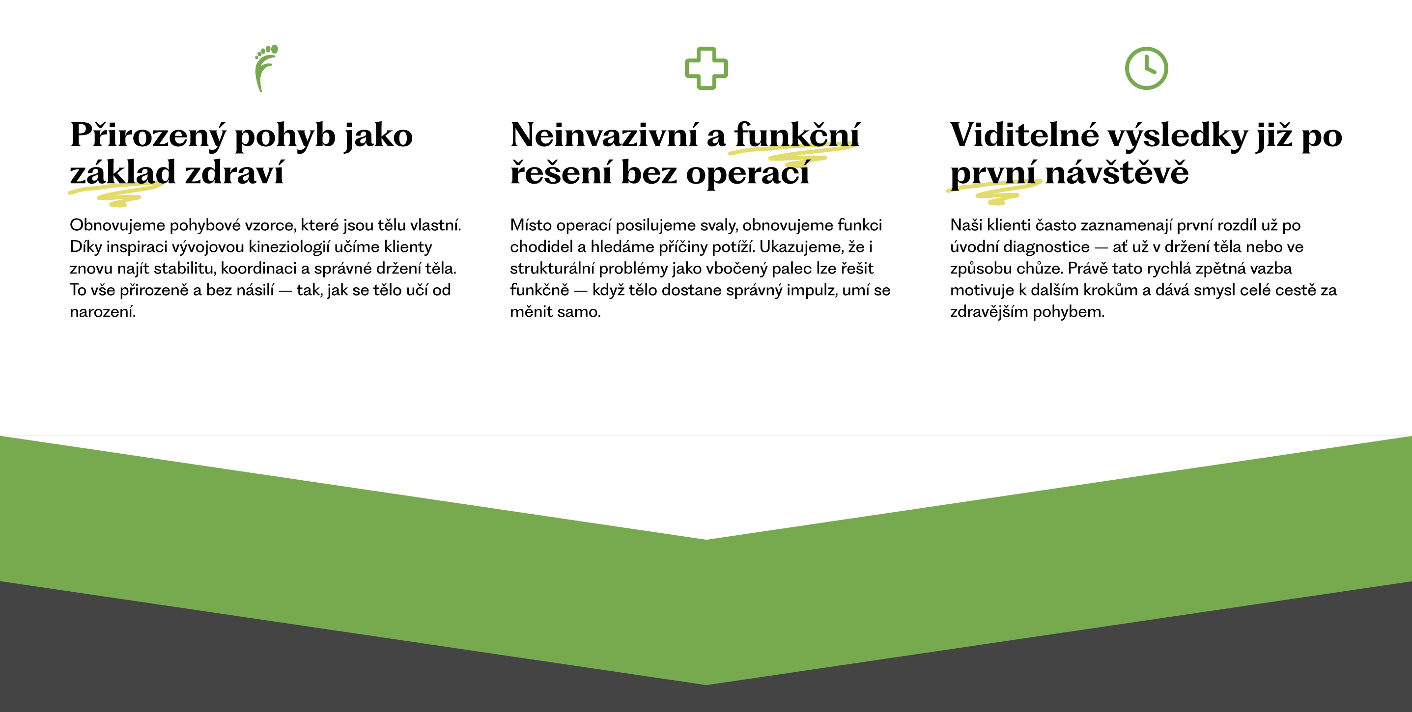
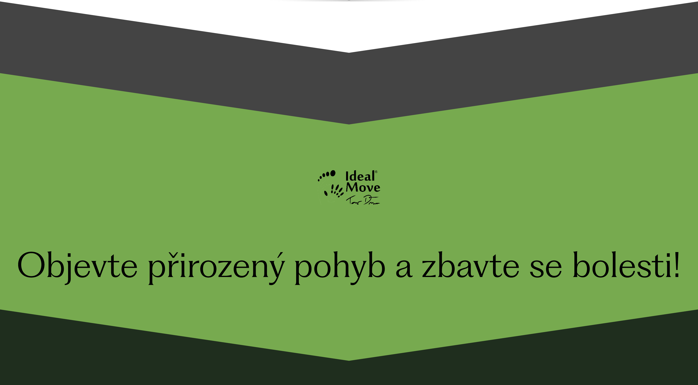
First, I went to update their visual identity. I picked a new font family to better reflect their brand - professional, but friendly and fresh. I also had to update their color palette slightly, as the original one was dysfunctional (low contrast) and didn't allow much creativity. I created and presented clear style guide, especially so that the client's marketers had clear guidelines for their visual work.
Then I proceeded to remake the site map and presented the client with wireframes of the sites, ensuring I didn't forget or mispresent anything important to their business. In the final designs I then included simple graphical elements (logo icon and downward arrows) to unify all pages into a coherent experience.
Special note
The biggest problem the client was facing, as it turned out, was the low performance of their booking system. At that time it was a 3rd party service, with very low customization options and overall very inflexible. To help solve this, I went beyond the job I was hired for and advised them on other available 3rd party services and got them in touch with a company that could provide a custom solution.
Special note 2
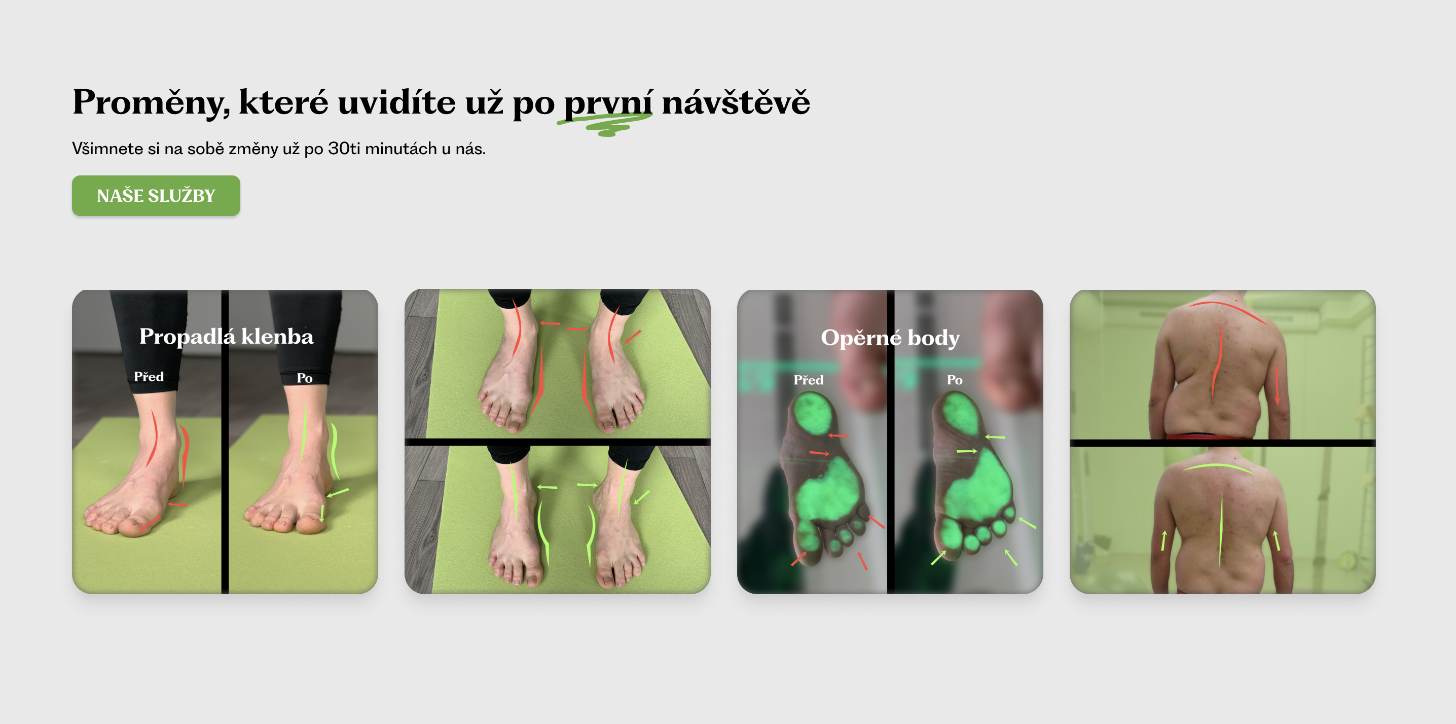
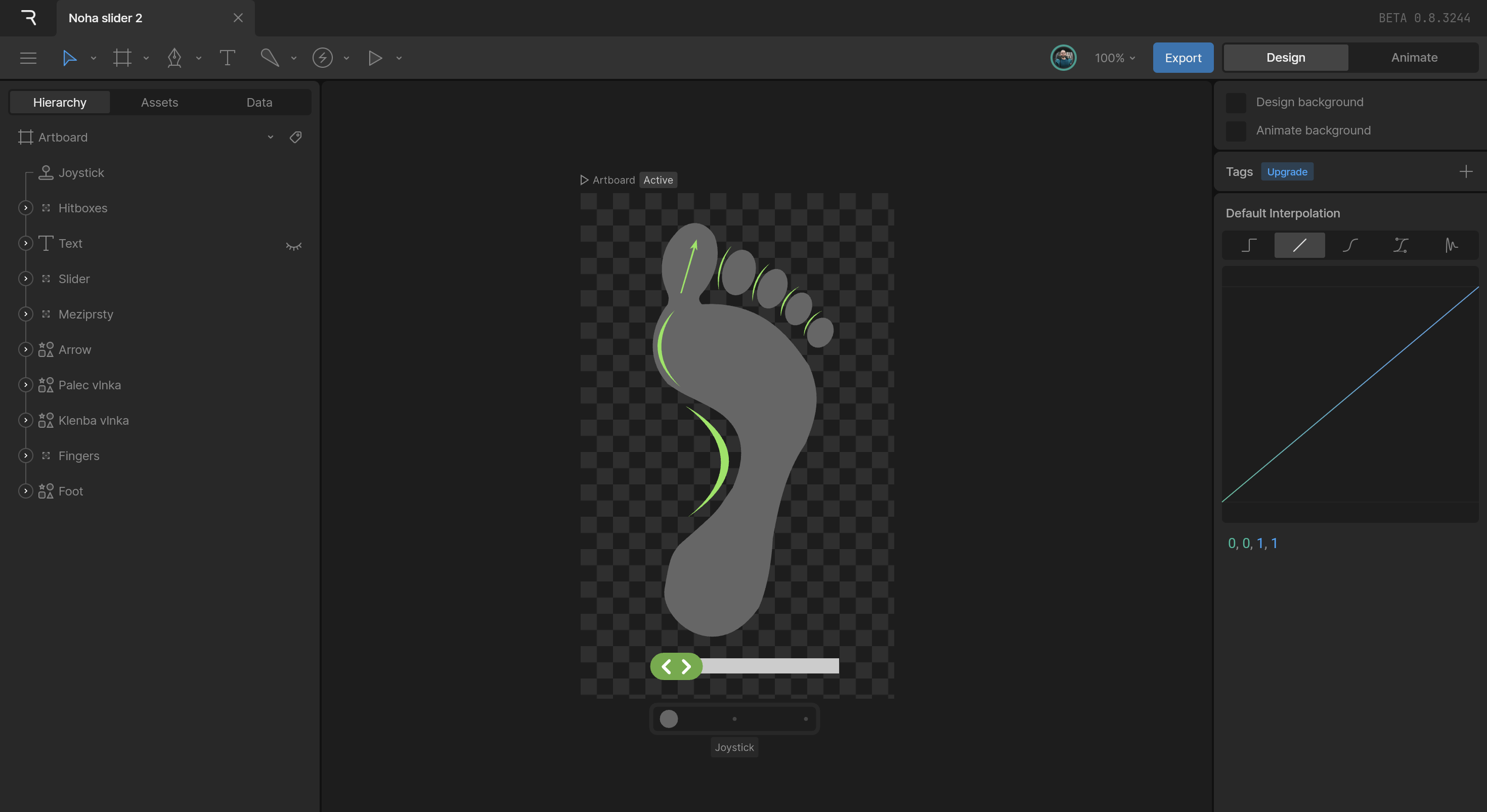
To help present how much can change for the customer in just one session, I created a set of custom, interactive, Rive animations, to be directly embedded in the web. The animations show a transition from a deformed foot to a healthy one, and the same with body posture.
The result
The result is a 14+ pages complex website, including blog, e-commerce, carrier offers, courses and more. The redesigned website is now visually unified, each page speaks the same visual language and presents information clearly, well suited for today's viewers. The moment I handed over the approved designs to a satisfied client made me very proud.